Designs that use type Garamond

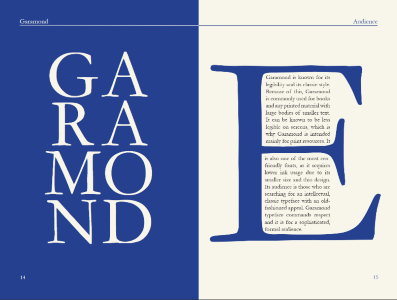
his design is taken from “Garamond Type Specimen Book” by professor Sarah Edmands and her students. The book’s goal is to explore the use and origins of the Garamond typeface.
On the left page, the word “Garamond” is cut in to smaller parts and displayed horizontally, fitting the orientation of the page. The use of white for letter creates a nice contrast to the background and the page next to it. On the right page, the “E” takes a large portion of the page, and its negative space is used as a grid for the smaller text.